CSS3 Gradient Buttons
Last week I talked about Cross-Browser CSS Gradient. Today I'm going to show you how to put the CSS gradient feature in a good practical use. Check out my demo to see a set of gradient buttons that I have created with just CSS (no image or Javascript). The buttons are scalable based on the font-size. The button size can be easily adjusted by changing the padding and font-size values. The best part about this method is it can be applied to any HTML element such as div, span, p, a, button, input, etc.


For more details on border-radius, text-shadow, and box-shadow, read my article The Basics of CSS3.
For more details on CSS gradient, read my article Cross-Browser CSS Gradient.


What Is So Cool About These Buttons?
- Pure CSS: no image or Javascript is used.
- The gradient is cross-browser supported (IE, Firefox 3.6, Chrome, and Safari).
- Flexible and scalable: button size and rounded corners can be adjusted by changing the font size and padding values.
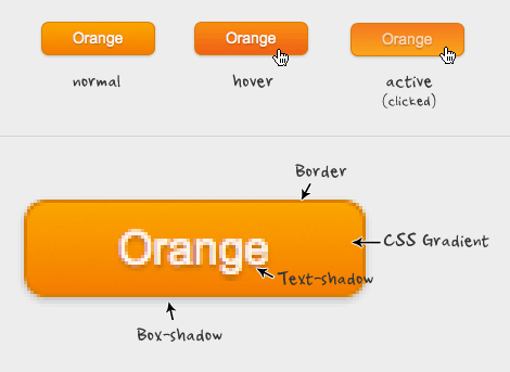
- It has three button states: normal, hover, and active.
- It can be applied to any HTML element: a, input, button, span, div, p, h3, etc.
- Fallback: if CSS3 is not supported, it will display a regular button (no gradient and shadow).
Preview
The image below shows how the button will display in different browsers.Button States
- normal state = gradient with border and shadow styles.
- hover = darker gradient
- active = gradient is reversed, 1px down, and darker font color as well.
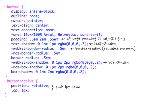
General Styles For The Button
The following code is the general styles for the .button class. I use em value in the padding and border-radius property to make it scalable base on the font-size. To adjust the rounded corners and button size, simply change the border-radius, font-size and padding values. For example: I can make a smaller button by decreasing the font-size and padding values (see demo).For more details on border-radius, text-shadow, and box-shadow, read my article The Basics of CSS3.
.button {
 display: inline-block;
 outline: none;
 cursor: pointer;
 text-align: center;
 text-decoration: none;
 font: 14px/100% Arial, Helvetica, sans-serif;
 padding: .5em 2em .55em;
 text-shadow: 0 1px 1px rgba(0,0,0,.3);
 -webkit-border-radius: .5em;
 -moz-border-radius: .5em;
 border-radius: .5em;
 -webkit-box-shadow: 0 1px 2px rgba(0,0,0,.2);
 -moz-box-shadow: 0 1px 2px rgba(0,0,0,.2);
 box-shadow: 0 1px 2px rgba(0,0,0,.2);
}
.button:hover {
 text-decoration: none;
}
.button:active {
 position: relative;
 top: 1px;
}
Color Gradient Styles
The code below is the CSS styling for the orange button. The first background line is a fallback for the non-CSS3 browsers, the second line is for Webkit browsers, the third line is for Firefox, and the last line is a gradient filter that is only read by Internet Explorer.For more details on CSS gradient, read my article Cross-Browser CSS Gradient.
.orange {
 color: #fef4e9;
 border: solid 1px #da7c0c;
 background: #f78d1d;
 background: -webkit-gradient(linear, left top, left bottom, from(#faa51a), to(#f47a20));
 background: -moz-linear-gradient(top,  #faa51a,  #f47a20);
 filter:  progid:DXImageTransform.Microsoft.gradient(startColorstr='#faa51a', endColorstr='#f47a20');
}
.orange:hover {
 background: #f47c20;
 background: -webkit-gradient(linear, left top, left bottom, from(#f88e11), to(#f06015));
 background: -moz-linear-gradient(top,  #f88e11,  #f06015);
 filter:  progid:DXImageTransform.Microsoft.gradient(startColorstr='#f88e11', endColorstr='#f06015');
}
.orange:active {
 color: #fcd3a5;
 background: -webkit-gradient(linear, left top, left bottom, from(#f47a20), to(#faa51a));
 background: -moz-linear-gradient(top,  #f47a20,  #faa51a);
 filter:  progid:DXImageTransform.Microsoft.gradient(startColorstr='#f47a20', endColorstr='#faa51a');
}
How To Use My Buttons?
Lets say you like the blue button and want to use it on your page:- First, copy the .button and .blue CSS (view demo source code).
- Then, add class="button blue" to the HTML element where you want the button to be (eg.
Button). The CSS classes can be applied to any element such as link, p, span, div, input, button, etc.
CSS3 Gradient Buttons
![CSS3 Gradient Buttons]() Reviewed by BloggerSri
on
12:40 AM
Rating:
Reviewed by BloggerSri
on
12:40 AM
Rating:
No comments: